
7DS - Creating a scalable Design System
Duration
Start: March 2023
End: January 2024
Skills
Atomic Design
Design System
Scalability
Role
Lead the creation of the v2
Background
What took a considerable amount of time for designers and the engineering team was any type of maintenance or component consultation within the library.
Considerations
✦ There was no Atomic Design structure.
Difficulties in component maintenance.
✦ Reusability across multiple projects
The goal of the 7DS was to have an open-source repository of molecules that could be used in all company projects.
✦ Accessibility
We strive to adhere as closely as possible to the established accessibility standards in building components and styles.
Some of the elements of the new Design System, the 7DS, already encompass the Atomic Design structure.
The Design Process
Building the Design System:
The first step was to map out all the components being used in the initial two Seteloc projects and rebuild them from scratch, breaking them down into molecules and reassessing the applied styles.
Style Guide
We looked for market references such as Adobe Spectrum, Apple HIG (Human Interface Guidelines), Google Material Design, among others. One of the main objectives was the standardization of the DS following accessibility principles, in accordance with WCAG (Web Content Accessibility Guidelines) best practices.
We also created tokens with usage standards for colors in component properties, padding, border-radius, and spacing.

7DS Style Guide.
Atoms
The atomic structure in the Design System contributes to the maintenance and reuse of components because it provides more freedom to the designer during creation.

Example of a Slot Component that enables easy switching of components and reusability.
Molecules

Example of molecule applied to componentization.
Organisms
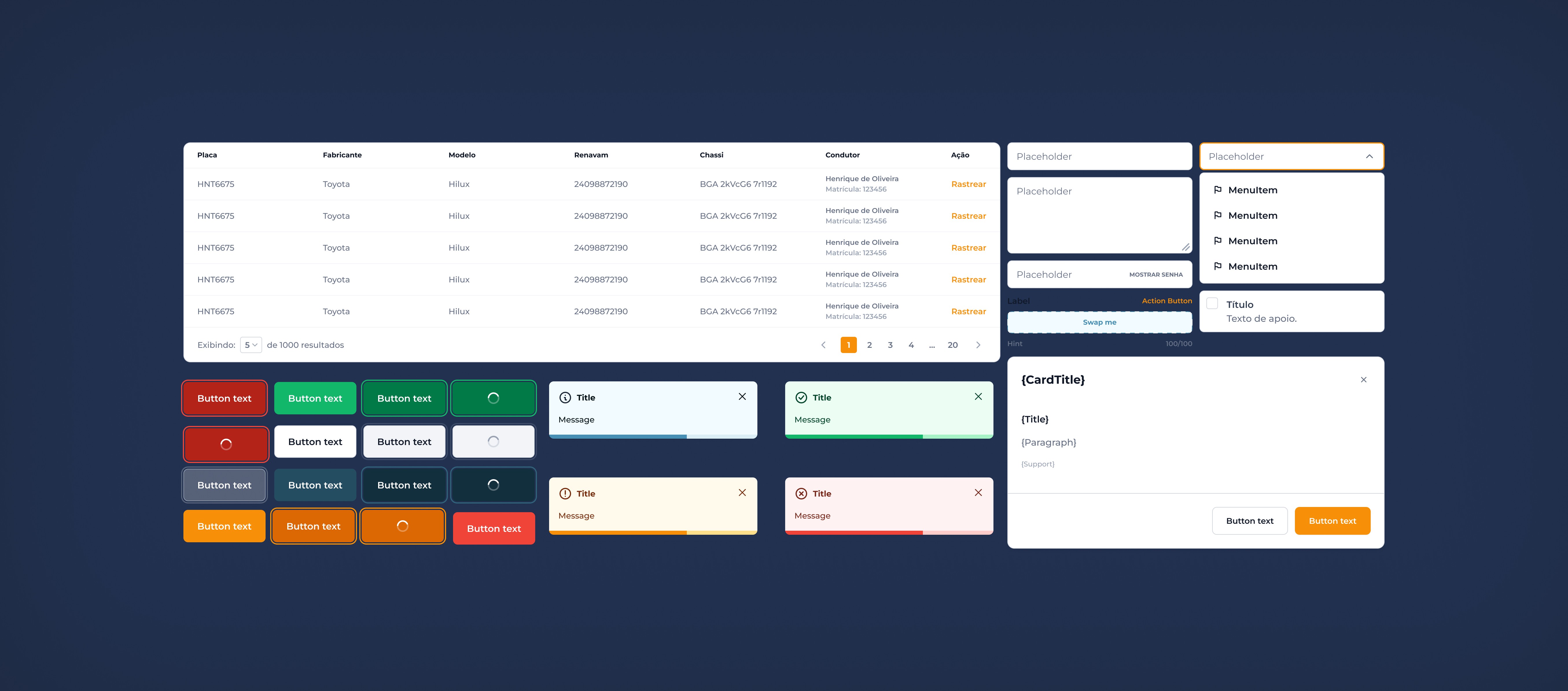
The most complex type of component, such as tables, is the most widely used component across all projects.

7DS tables built as organisms.
Iconography

Icon library.
I added descriptions to all icons in a way that would facilitate the team when searching in Figma (considering the context).

Similar words will help design to find the right icon.
For controlling the size of icons, I created the iconWrapper component, which takes into account the value entered in the auto-layout to resize the icon to the desired size.

Conclusion
Throughout the entire process, I was able to perceive my growth, recognized both by the team and by myself. I overcame challenges in areas of Design that were initially outside my comfort zone, and I am grateful for having actively participated in each stage of this project. This experience was fundamental for my professional development.
Insights:
Increase in design team productivity and consistency;;
By mapping out all scenarios and states of the created components, we also increased the productivity of the development team.