


Creating a new experience for the São Paulo Metro app
The problem
This project aims to analyze the São Paulo Metro's app and understand the reasons why users of the service choose other applications instead of the official Metro app. Additionally, the project proposes improvements to the app's experience and interface in order to provide a more efficient and appealing service to users.
The App
With the advent of apps, many products and services have been automated or completely replaced, such as the phone book, trips to the grocery store, shopping, and the subway was no different. Launched in 2013, the São Paulo Metro app aims to serve its audience with features such as route calculation, station and line inquiries, and maps.

App released in 2013.
User's opinion
While investigating the satisfaction level of users on the application download platforms (Google Play and App Store), I identified several criticisms regarding the interface, usability, and lack of functionalities. This was driving users away and compelling them to use other apps, such as Google Maps, to perform the same tasks. Some of the main observations raised by users were:
Functionality: The app lacks useful features compared to the competition. Interface: Users complain about the outdated interface and accessibility issues.
Interface: Users complain about the outdated interface and accessibility issues.

User complaints on the application download platforms.
Proposals for improving usability and interface
I navigated through the main features of the application and classified them based on the violations of Nielsen's Heuristics found. I also suggested improvements not only in usability but also in the interface.
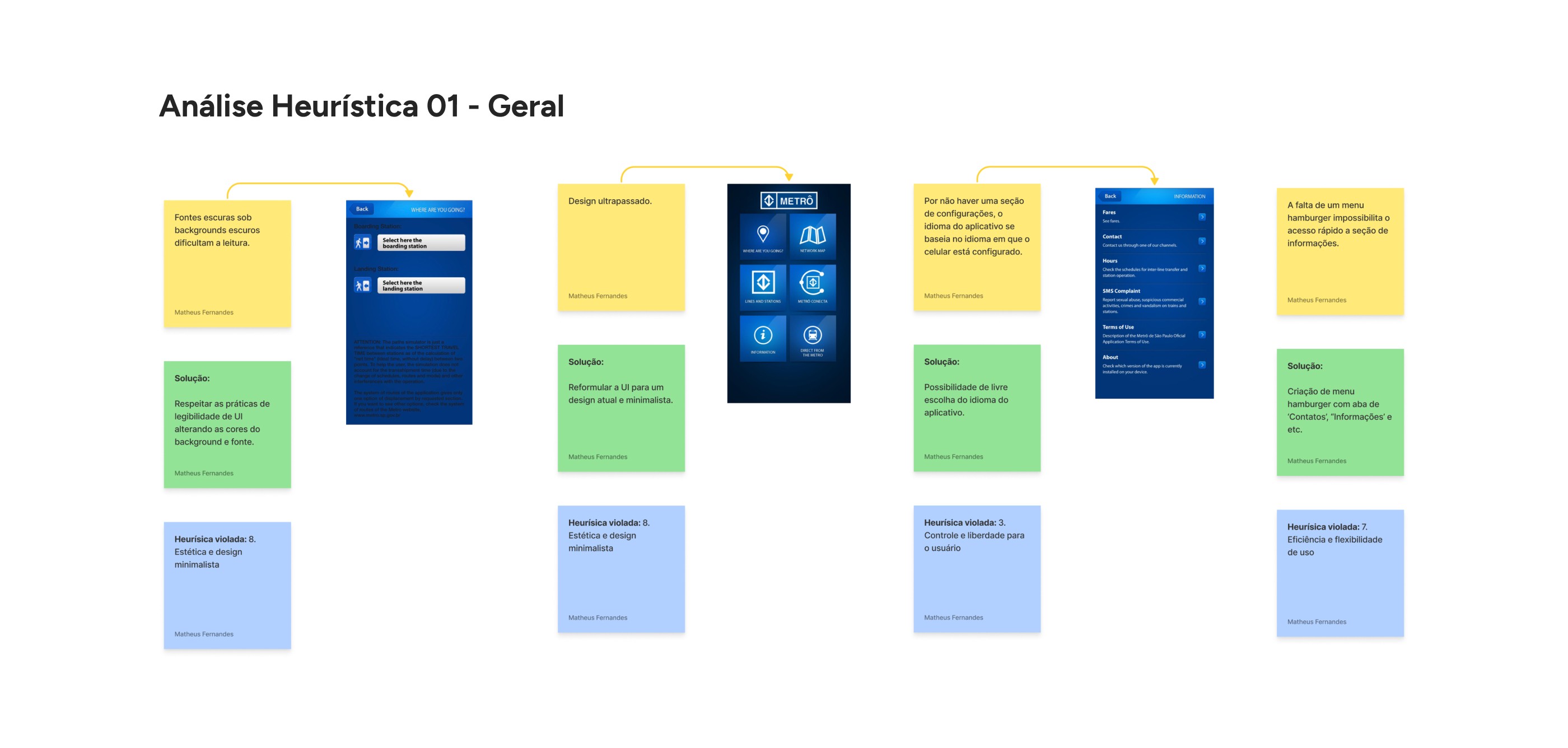
Mapping of violations and proposed solutions.
New features
As mentioned earlier, due to user inquiries about the app's utility, I analyzed major players in the payment and transportation platform market to inspire the creation of new features that would fit into the project's context.

Some of the insights I gained during the project evolution.
Companies such as Picpay, Steam, MercadoPago, among others, served as a reference to develop ideas for new features for the app, including: Wallet, QR Code Ticket, Registration, and Favorite Routes.

Proposal for new features for the application.
Restructuring the architecture
For a complete understanding of the application structure, I mapped the current flows:

Mapping of the current flow.
After mapping, I restructured the architecture, also implementing the new features:

This flow also includes the implementation of new features (which will be addressed later).
From wireframe to hi-fi prototype
For this phase, I used journey definitions alongside the wireframing process to create the layout for each screen, incorporating the new functionalities. This approach facilitated the creative phase and overall project understanding.

Demonstration of the use of the 'Service Request' journey for the evolution of the wireframe.
A new interface
The layout underwent several changes until the final result, aiming at rebranding and achieving a refreshed visual.

Evolution process of the new interface.
Recruitment and usability testing
To validate the above steps, I created a usability test script, where 5 real users of the Metro service were contextualized with each journey and its objective, aiming to identify possible inconsistencies in usability and interface.

Example of a scenario created for the task 'Create favorite route'.
The criteria for recruiting participants were:
Age: 25 to 70 years;
Frequency of using the Metro service: Frequent, moderate, and rare;
Familiarity: Mobile device users.
Prototype tests were conducted remotely (screen-sharing) and divided into 7 tasks, where users interacted with the high-fidelity prototype and reported their level of difficulty and satisfaction during execution.
The difficulty levels were divided into:
Easy (No difficulty in completing the task);
Moderate (Some difficulty in task execution but nothing that impacts completion);
Difficult (A lot of difficulty in task execution).
Overall, user feedback indicated that the app provides intuitive navigation and ease of task execution.

Results of tasks after user testing.
Changes after testing
The points of concern mentioned by users focus on the Onboarding screens and also on the 'Generate Ticket' button. For the first issue, add a directional icon to the Onboarding screens.

The arrow indicating the swipe direction for onboarding addressed user concerns.
Another point of concern mentioned by users was the 'Generate Ticket' button, where two of the interviewees could not immediately find the function but did not see it as a hindrance to completing the task.

Button 'Generate Ticket' located in the center of the navbar.

Conclusion
The entire process was very enriching for my learning in all areas involving design. I also learned that many products fail when user feedback is not considered.
I discovered that many products end up failing when user feedback is ignored, which can lead to design and product functionality failures.
User opinions should be used as the primary tool for refining any product.